BUSINESS CARD/LOGO
  |

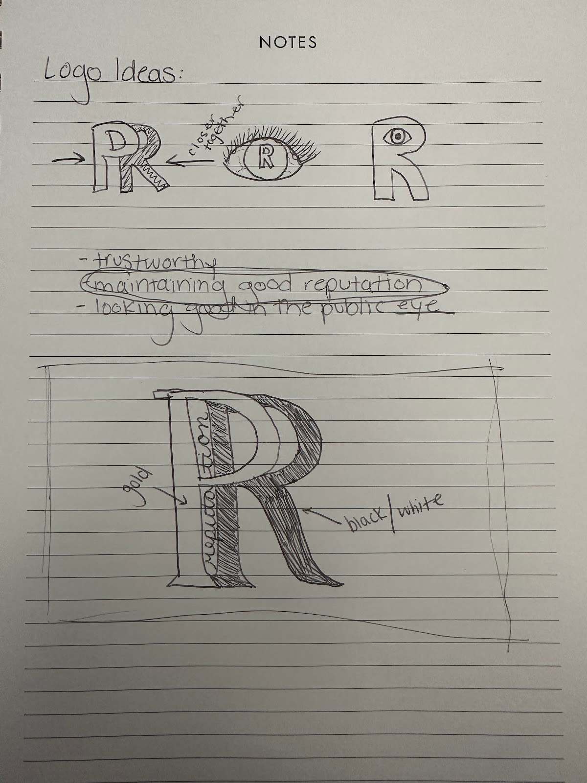
This is the logo I chose for if I had my own PR Agency, Reputation. Reputation helps both companies and individuals build and maintain a good image with the help of the countless employees in the agency. When I knew I wanted to create this for a mock agency, I started out by brainstorming words and phrases that the company would value, such as...
- loyalty
- building a reputation
- commitment
- trust
After a bit of brainstorming, I decided to keep it simple with "reputation". The main idea of public relations is to help build a good reputation, and that was the point I wanted to get across.
When creating the logo, I wanted to keep it clean and classy. Black, white and gold seem to fit these characteristics, so I decided to go with that. I thought that if I used to many colors and designs, it would make things chaotic and struggle to get the message across that I was looking to make. As for the font, I used a clean and strong font for the "PR", and then a softer, more elegant font for "reputation". I think the contrast adds a unique perspective to the logo and help it stand out. I put the "P" and "R" close together so that it almost looks as though it's just a "R". I did this because that could stand for "reputation" as well. The black card also helps make the logo stand out.
With that being said, my final product for my logo and business card can be seen above, Reputation Public Relations Agency. While creating, I sketched out different ideas for possible logos, and placed it on some 3D images, both of which can be seen below.

Comments
Post a Comment